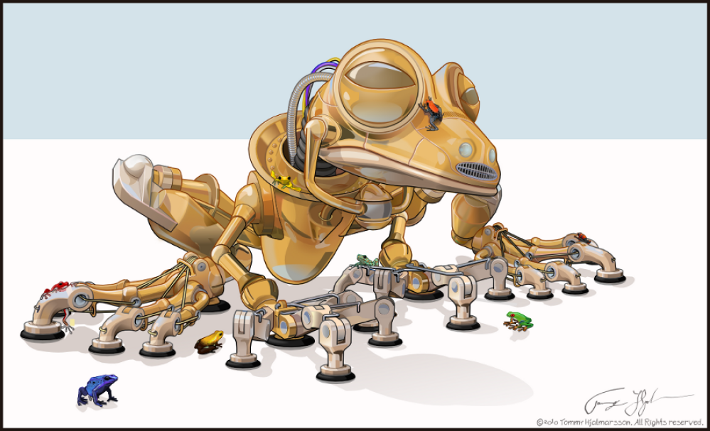
Art by Tommy Hjalmarsson (All right reserved by the artist)
Inkscape is a powerful vector graphics drawing and editing tool that enables designers and artists to create advanced vector-based design work. It is so features rich yet simple to use, and that’s why I love it so much. Everyone can use it without knowing or learning advance stuff. There is a document that teaches you the basics and advances How To’s without leaving Inkscape.
With all these advanced capabilities, the UI of Inkscape seems simple. It encourages people to do something with it right from the start without scaring them off with complex UI, bloats and clutterings, and bad user experience. Inkscape is more similar to Corel Draw in terms of looks and feels. But so lightweight and it requires less powerful hardware to run.
I love this program so much and I’m using it for almost 4 years for my professional works. But its the recent release that made me extremely happy with this piece of open-source software. On May 4th, 2020 they announced Inkscape 1.0 to be released for Linux, Windows, and this year, also for MacOS (which was not available before).
Inkscape 1.0 not only solved previous bugs and shortcomings, but they also brought some life-changing features for me. Now, there are still some features I expected so much but didn’t make it to this release, I will talk about these and also provide a workaround to fix those. Let’s talk about it, shall we?
Improved canvas
The new release eliminated the weird glitchy view-port and brought major performance improvement. So no more glitching when zoomed in, no more tearing and slow down on large documents with tons of objects. Some new view-port features are here too, like rotating canvas, pinch to zoom for touch input devices and screens, ability to mirror canvas, and more.
There are few features I expected, but not yet released like exporting multiple objects separately at once. There is a Plugin based solution though, and you can try it. Simply follow this link and the instruction provided in the details panel.
User interface
The user interface of Inkscape 1.0 has improved a lot compared to any of its previous versions. Now, Inkscape 1.0 UI is built using GTK+ 3. So it matches your GTK system theme and configuration. Also, it now supports theming and toggling between light and dark mode. You can choose custom colors for the tools as you desire.
Although it’s a cool thing, I wish I had the ability to choose different colors for different parts of the UI. But hey, Adobe Illustrator has nothing like this so. Inkscape now supports High-resolution screens and enabling HiDPI support. This makes the UI look sharp and viewable on larger high-density displays.
You should notice some minor changes in the toolbox, as it is now grouped in logical orders. So, Editing tools are on the top group, Shapes on the second, Drawing tools are on the next group, and so on. All groups are divided by a small line. Another small change is on the Number fields (height, width). So now, you can Scroll to increase or decrease numbers with just hovering on them.
Editing features
Finally, a feature that is so welcoming. This changed my way of working. Previously, there was no way you could select and move an object that is sitting on the bottom without alt select and bring it on the top. Now you move objects that are deep down without moving it on the top or anything by simply toggling the X-Ray Mode. This mode does what its name suggests, enabling you to see through your document objects in wireframe.
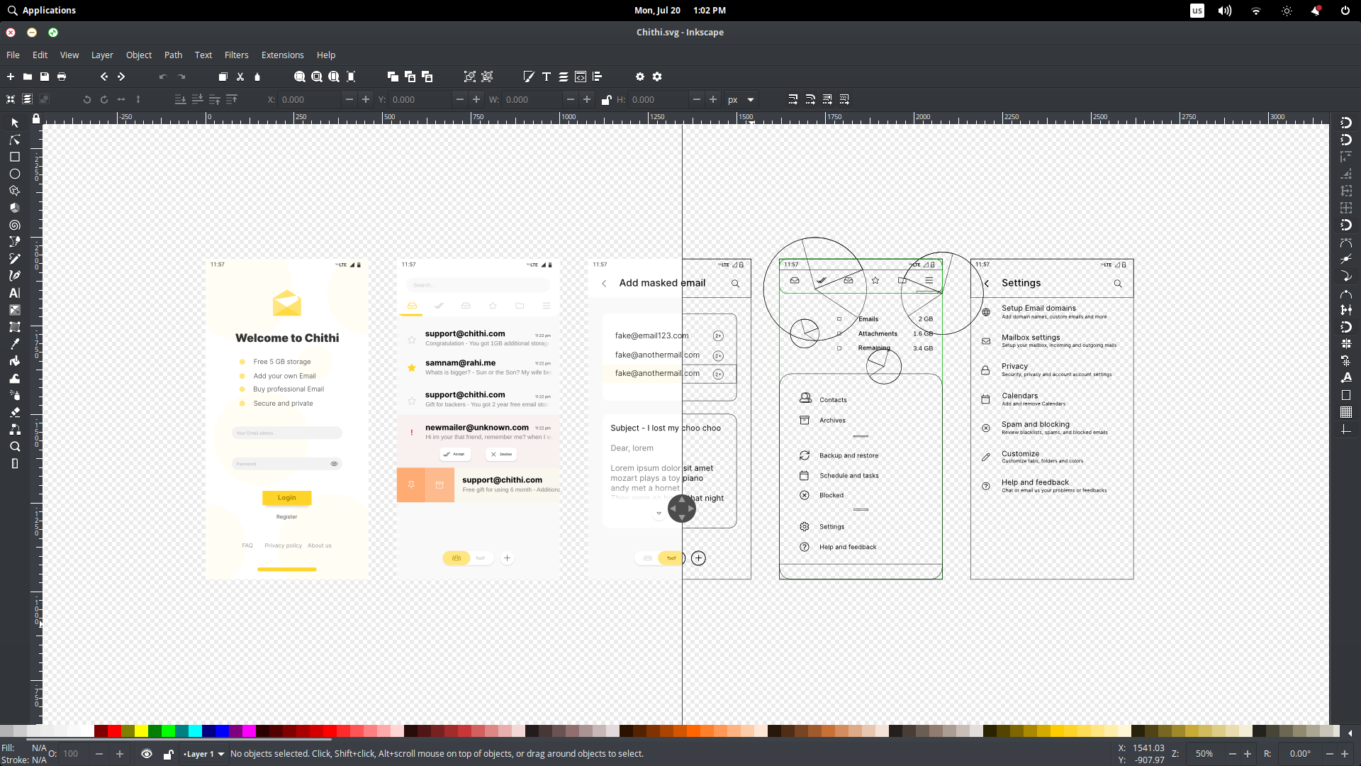
With this toggled, simply select the underlying object and move it as per your desire. Not only this helps you editing large documents with lots of objects without accidentally moving the wrong object, but it also saves your time when editing big multilayered documents. You can enable this mode in two ways. Either going View → Split View Mode or with View → XRay Mode. The first mode adds a split view while the second one shows objects on the canvas in outline mode that follows the mouse pointer.
Drawing tools
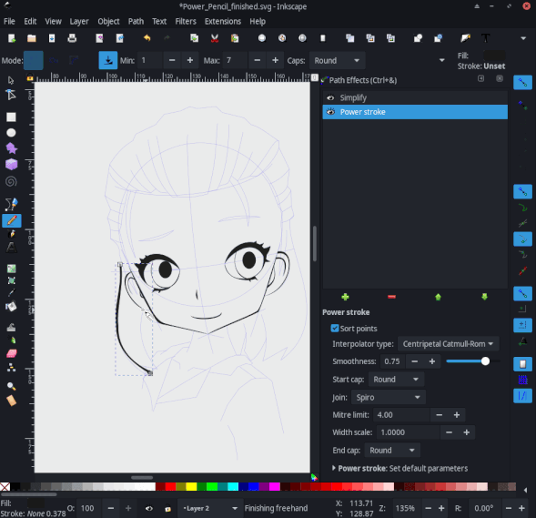
Say welcome to the most powerful pencil tool for a vector drawing tablet. Better than Adobe Illustrator. Inkscape now enables you to draw stunning pencil drawing with PowerPencil. This features utilizes the power of the Live Path effect to provide pen pressure support, quickly changing stroke width ratio, closed path, and Caps which enables you to set different end caps for your stroke. This not only gives you the ability to draw pixel-like digital arts in vector but also gives you full control for changing and modifying each drawn pencil strokes. Power of vector you can say.
The measurement tool is also improved. Now you can hover to display object details and group details like width, height, and more. The circle tool and the curve tools had some minor improvements too.
Text tools
The text functionality has gone through some major changes and improvements. There are some features that are extremely helpful if you are working with documents that have lots of texts on it. You can now Flow text into frames by toggling Text → Flow into Frame option.
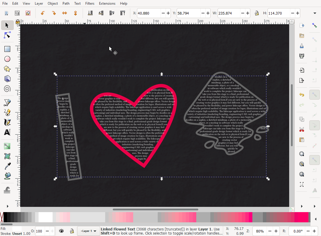
This helps you to put texts on to frames with ease. The toolbar is now more compact with the alignment options now in dropdowns.

Inkscape now supports better line-height management. This includes
- Line spacing settings got an overhaul and are now much easier to use. Gone is the unwieldy? button; this is now handled by selecting text on the canvas.
- Setting line height works like this now:
- For the whole text: click anywhere into the text without selecting anything, then adjust the line height in the tool controls bar.
- For a specific line: select the text in that line, then adjust the line height in the tool controls bar.
- Set the global line height first, and the specific line heights last. Changing global line height later will remove any line-specific line-heights (even just changing the unit will unset those ).
- Line heights for single selected lines cannot go below the height set globally.
- If more than one line is selected, the line height in between those lines can go below the line-height set for the whole text.
- The line-height settings work in all four text types.
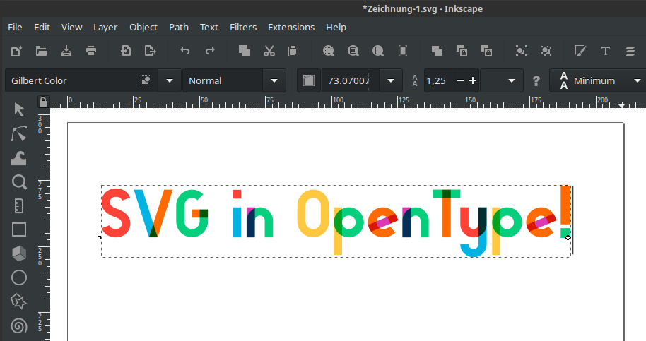
Basic support for variable fonts and Open Type SVG fonts are now available
There are other smaller changes and improvement which I won’t go through in this article.
New Live Path effects
Live paths are so useful when you want to apply a quick effect that can be edited later anytime. You can apply, let’s say Bend Path to bend any path, and adjust its value any time later. This helps you to work more efficient and non-destructive way.
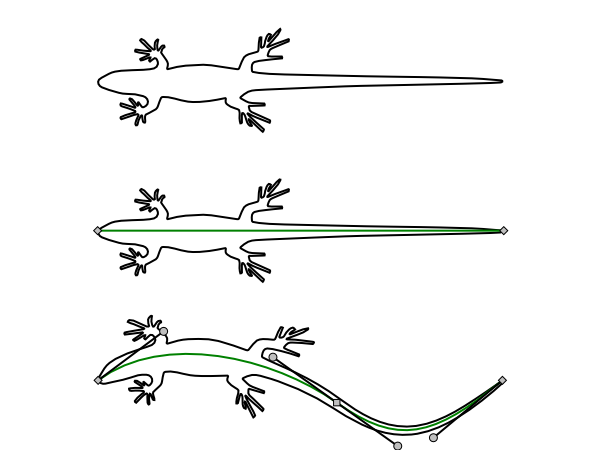
New path effects have been added, a panel for selecting path effects has been overhauled. Now the Path Effect selection panel allows you to search for a specific LPE and get an icon preview and text info of what it does. This is very handy for finding an LPE and know what it does before applying and testing every option. Adobe Illustrator has no such option.
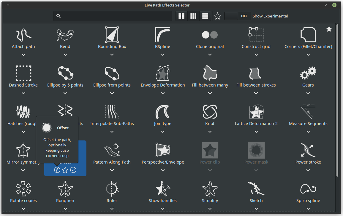
There are few new LPE added in this release like:- Ellipses from a point, Fillet, and Chamfers, Measurement segments, Offset (for setting text and path offset), Power clips and power masks. Some experimental LPE’s have been added too.
One of the broken features I would like to be fixed soon would be adjusting the Filter region. This will help to fix blurred objects with clipping area issues.
There are lots of other small changes that are wonderful. But for me, they aren’t that useful. Many under the hood and developer-focused improvements are there too. Some changes like Interactive Mockup Generator are much useful for some specific group of artists, like Prototypers and UI designers. Some features have been removed such as Open Clipart Import. Goodbye Clipart importing. This feature seems replaced with Symbols.
Conclusion
Inkscape proved itself worthy as an Advance graphic design tool same as Corel or Adobe’s vector programs. And with the Inkscape 1.0 release, it gave us new hope that Open Source Softwares are rising. CMYK should be added soon until then some printable documents will still be designed with Scribus NG. I also hope they add native support for multiple artboards and multi export capabilities. We can hope because Inkscape 1.0 brought a lot we desired for long. And soon we can finally use Inkscape for every type of professional design work.


