Previously I wrote about using open source software for graphic design. Which you can read here. I have also written about choosing hardware for graphic designing in Linux here. In today’s article, however, I’m gonna teach you basic editing with GIMP 2.10. Which will help you to understand how GIMP works and how you can create basic edits using GIMP 2.10.
Instead of writing basic techniques and boring instructions, I will instead guide you through the basics by helping you create something using GIMP. So, let’s create a beautiful Facebook cover while learning the basics of GIMP.
Before getting started, you need GIMP installed on your system. If you have it installed already, make sure you are on the latest version. If you do not have it installed, follow this little instruction to easily install GIMP’s latest version on any Linux distribution.
Table of Contents
Installing GIMP
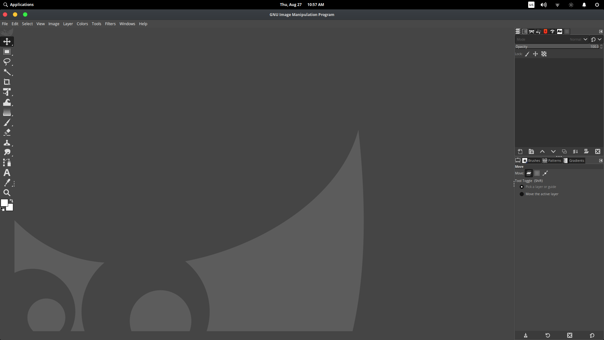
GIMP 2.10.20 UI
If you are using an older version of Ubuntu or Linux Mint, you probably will find an older version of GIMP in your current repository. So I suggest not to install it. You should install the Snap or Flatpak version instead. Because these are universal packages that are installable in every Linux distro, and you will also get the latest version whenever it gets released.
Another thing to note. The latest version of GIMP with PPA has been dropped by otto and the new Ubuntuhandbook PPA creates a huge problem and it won’t start. I strongly suggest installing it from Snap or Flatpak.
You can install GIMP Snap with this command
$ sudo snap install gimp
Or you can install GIMP Flatpak from here.
Creating a new canvas
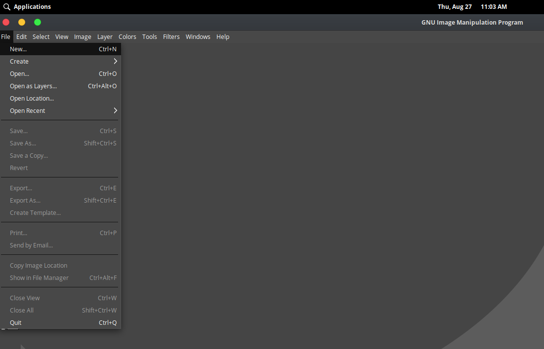
You can create a new canvas using File > New or you can press ctrl+N keyboard shortcut to open “New document” dialog. From then you will need to specify the size of your document, or you can choose from many templates.
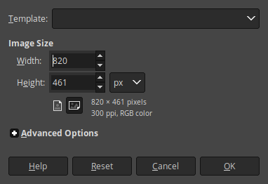
Here I have specified Width: 820px and Height: 461px. Note that, you can use CM or IN instead of PX when you want to work with posters and other printable documents. Its the ideal size for a cover. If you want to make your cover high resolution, you can keep the same ratio and increase document size. Here is a pic from Hubspot that shows how Facebook cover size determines the view.
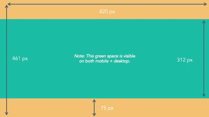
The yellow area or full height of 461px will be visible on mobile devices. However, only 312px will be visible in the desktop view which is painted green in this image. So we need to work on this green area only. Let’s mark the canvas with guides so we know which area we need to work in.
After creating a document, you should mark the safe area. To this, we will use Guides.

The area marked in red is called a ruler. If you click and drag down with the mouse, you will be able to add a guide to your canvas.
Lets create a guide on 75px top
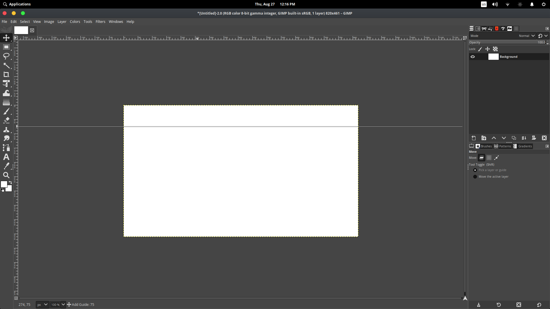
When dragging the guide down, you will see an indicator at the bottom of your screen telling you how far you have placed the guide.

Add Guide: 75 means you have placed the guide 75px down from the top. Which is in the right position as we wanted.
Same way, we also need to place another guide at the bottom, and we need it to be placed at 386
Note: Guide helps you with pinning area and safe zones
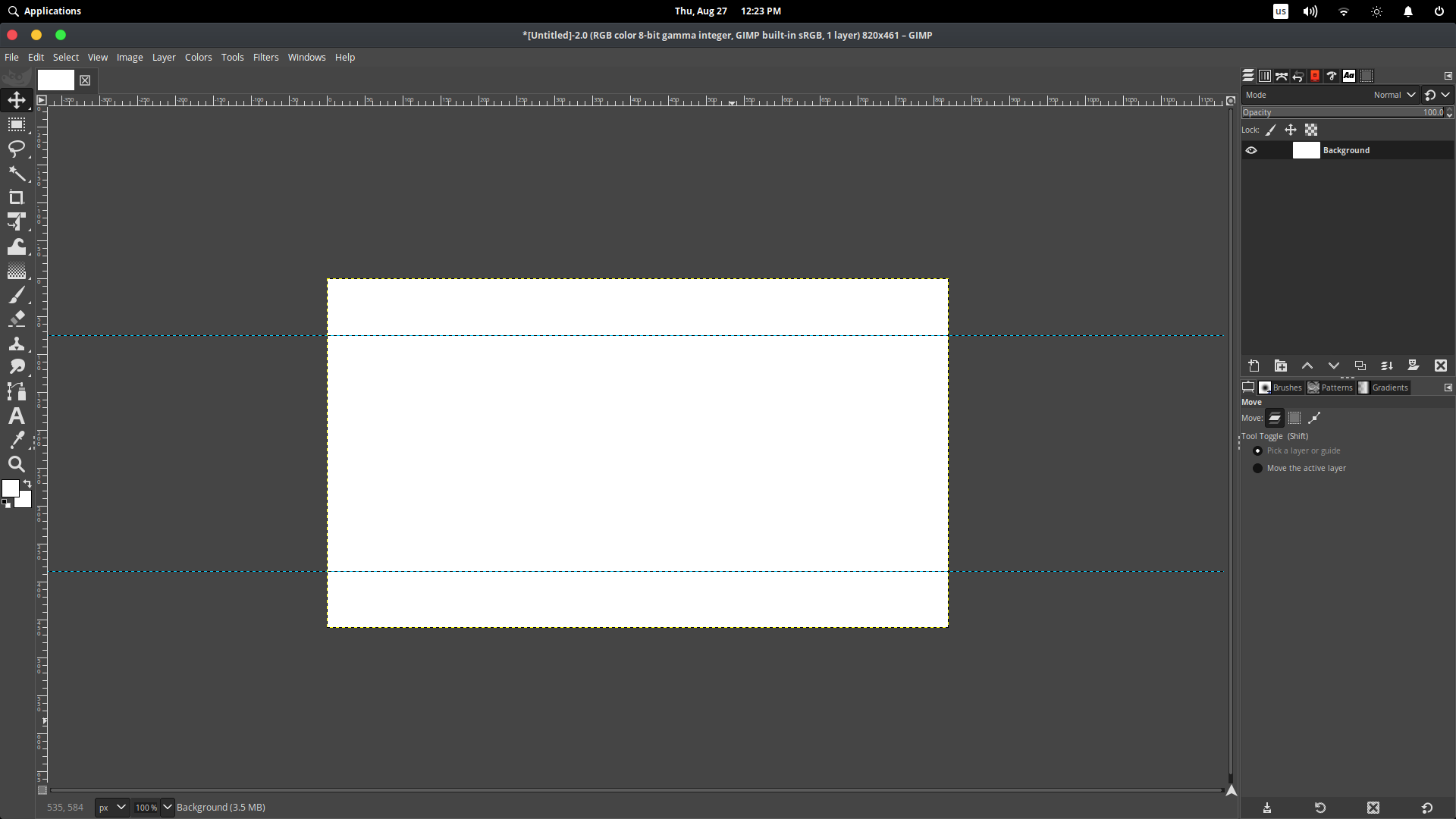
We have successfully created a canvas for an ideal sized Facebook cover. Now we need to start working on our cover to make it meaningful. And we will be making this simple cover
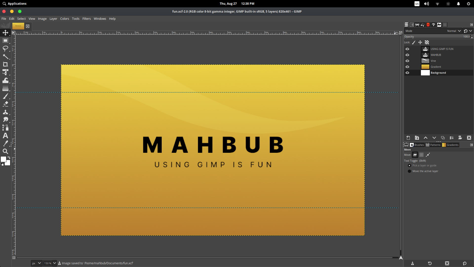
This cover is quite simple and minimal. But while making it, you learn all the basic stuff like moving objects, creating layers, naming and organizing layers, creating objects, gradients, using texts, and some keyboard shortcuts. So let’s start making it.
Note, save the file before working, and always save after every change. You can use “Ctrl + s” to save your progress quickly.
Making the cover
First, we need to add text. If you have the font Inter installed, congratulation. But if you are not, first install the font Inter from here. If you don’t know how to install a font family, follow this
Create a directory on your home folder name “.fonts”
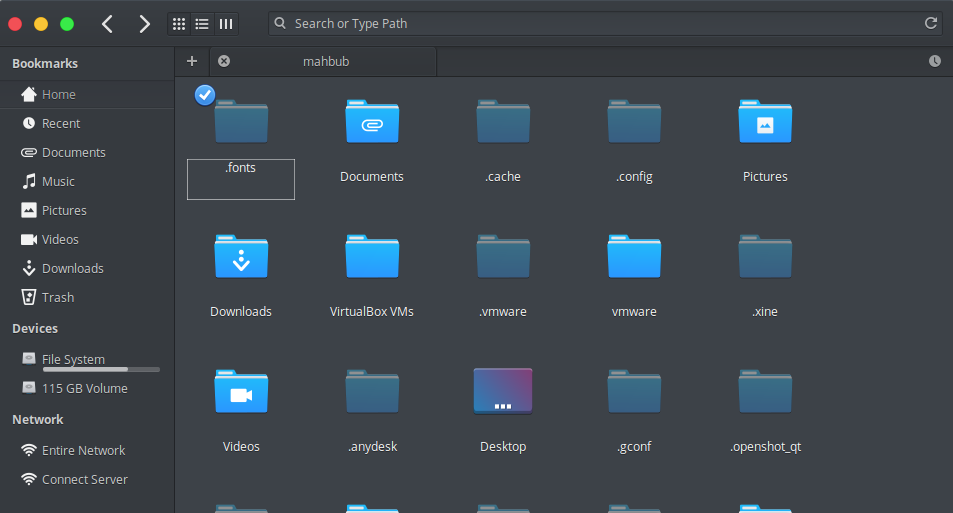
Then you have to copy all the fonts you downloaded (.ttf, .otf, etc) into this folder. Then you have to rebuild your font cache by opening a terminal and typing
$ fc-cache -f -v
then pressing enter.
Then you have to reopen GIMP in order to use newly installed fonts. If you have the Inter font installed, you are good to go, so let’s start typing
Go to your canvas we already made ready, and select the text tool icon looks like this

and you can also enable it by pressing “T” on the keyboard. After selecting the text tool, click on anywhere on the canvas and type your name :
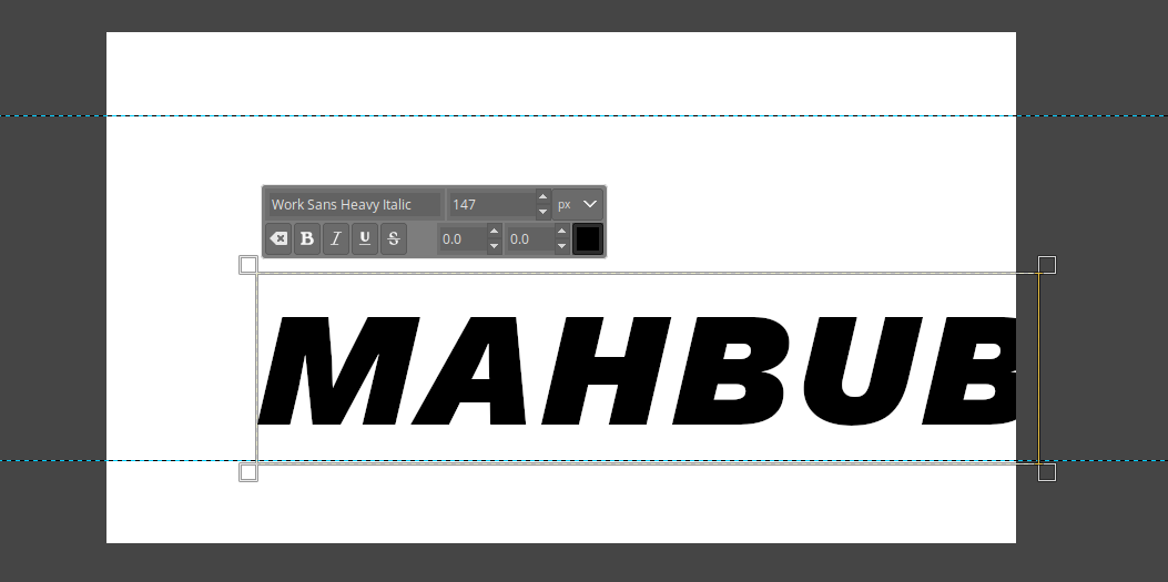
As you can see, my text looks weird and big. That’s because I have previously worked with this font size. So it remembers it and automatically applies the font size. But we don’t need such a big font size and we want to use Inter font for our text.
So let’s select all the text using “ctrl + A” and after pressing, all the texts in that textbox will be selected
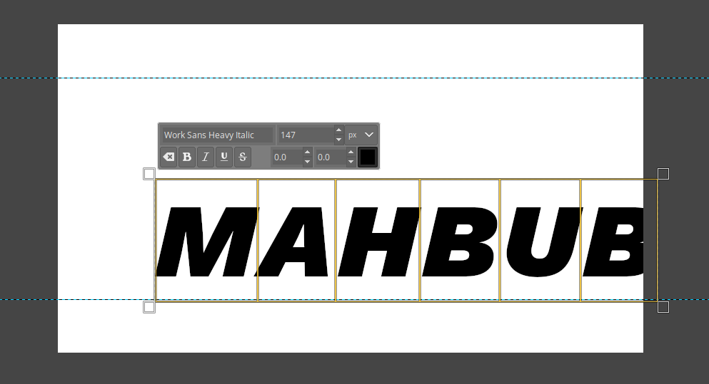
Now you can see a dialog at the top with font name, size, and color. We want to change those. On the top floating dialog that shows current font, delete the current font name and type Inter heavy
Note: Be sure to select all the text using “Ctrl+A” before applying any changes
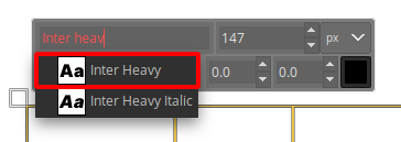
You don’t have to type full name, as you can see here. You need to select Inter heavy as we are using this font style for our cover. We will also select the font size of 60 px. Make sure your text is black, if it’s not, you can change the color with the color selection square.
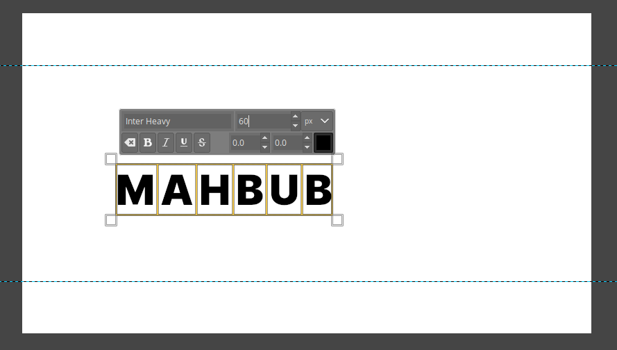
After changing the text style and size, it looks like this. Then we want to increase the space between letters so it looks stylish. To do this, we will use tool options and increate letter spacing. While your all the text is selected, type 22.0 and hit enter
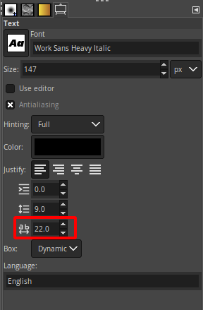
It will make your text look spaced like this
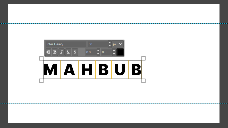
As you can see, our text isn’t aligned in the right way. We need to bring it to the exact middle.
Aligning text with alignment tool
To do this, we will use the Alignment tool. If you select
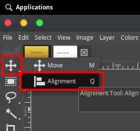
This tool (press Q for a keyboard shortcut), you will be able to align your text in any positions. We want to align our text to the middle of the canvas, so we need to drag all over the canvas. This will select all the objects on the canvas.
Before selection
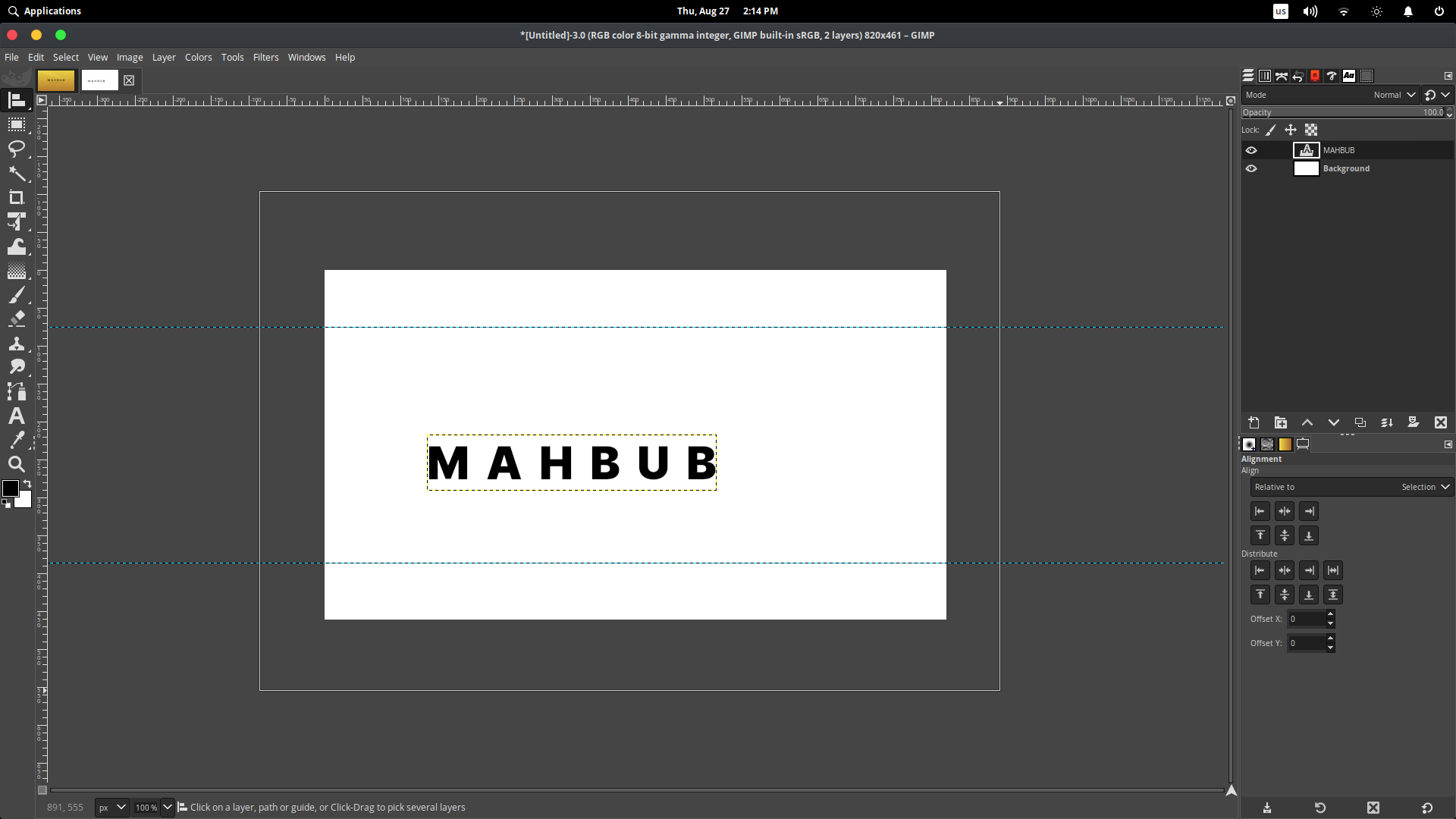
After selection with Alignment tool (notice the corners)
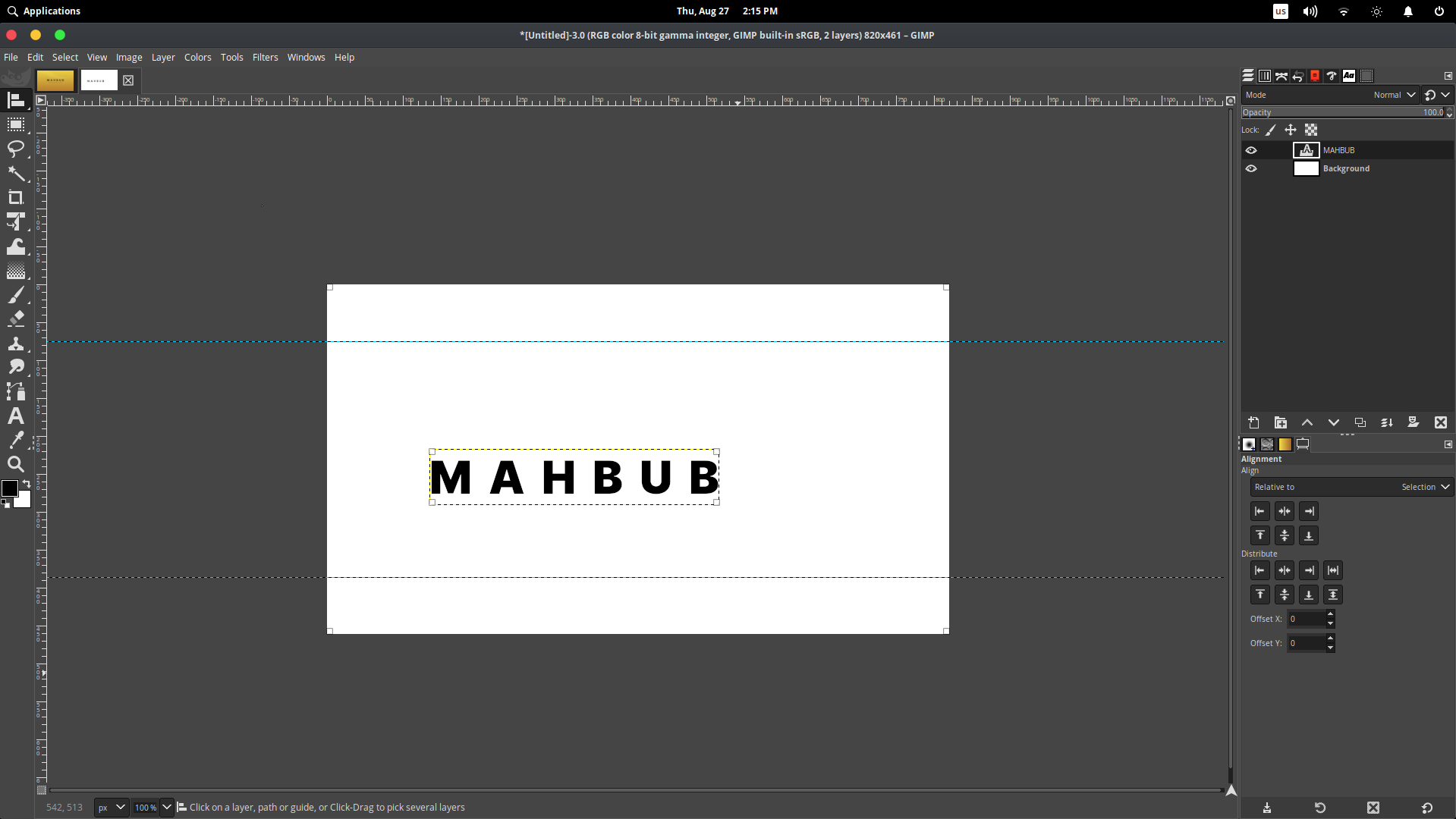
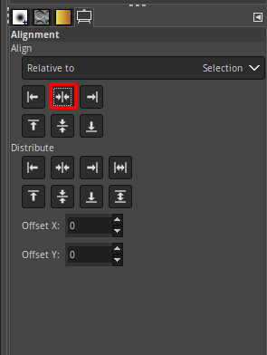
As you can notice, there are white squares on the corner of every object. Make sure both the canvas and the text are selected using the Alignment tool and then you have to click on Align center of target button

And after this, you will see your text is aligned exactly in the middle of the canvas vertically.
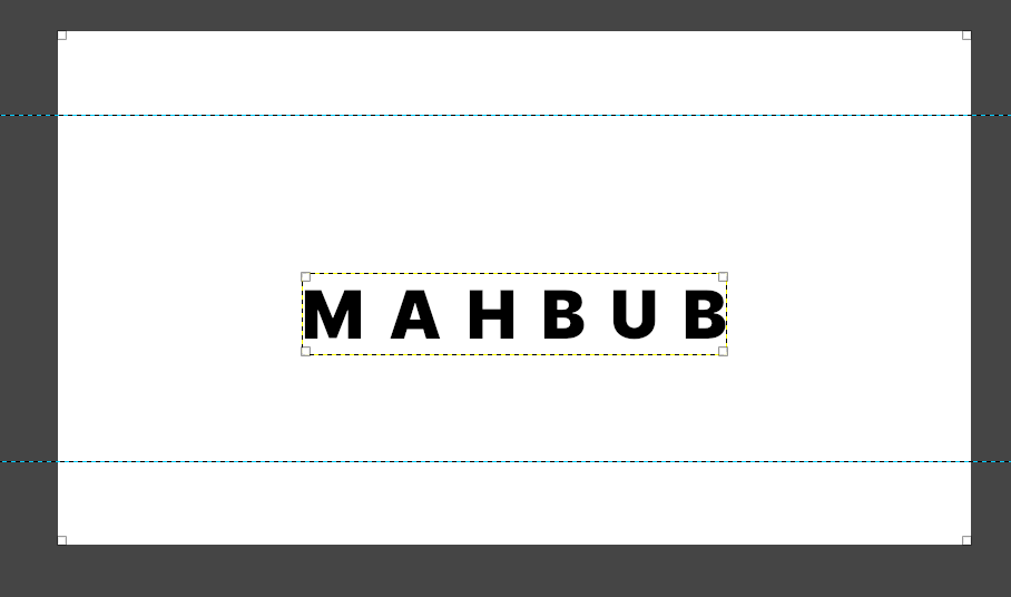
Hurray, you learned how to align text. Now we need to add a tagline to our cover.
Adding tagline
To add another text, we need to select the text tool again. You can again, press “T” to enable text tool faster. We will add another text. Let’s write “USING GIMP IS FUN” but this time, keep the font size to 20px and change the font to Inter Medium the same way we did before. We will change the letter spacing to 8.0 for this text.
After adding the tagline text, it will look like this
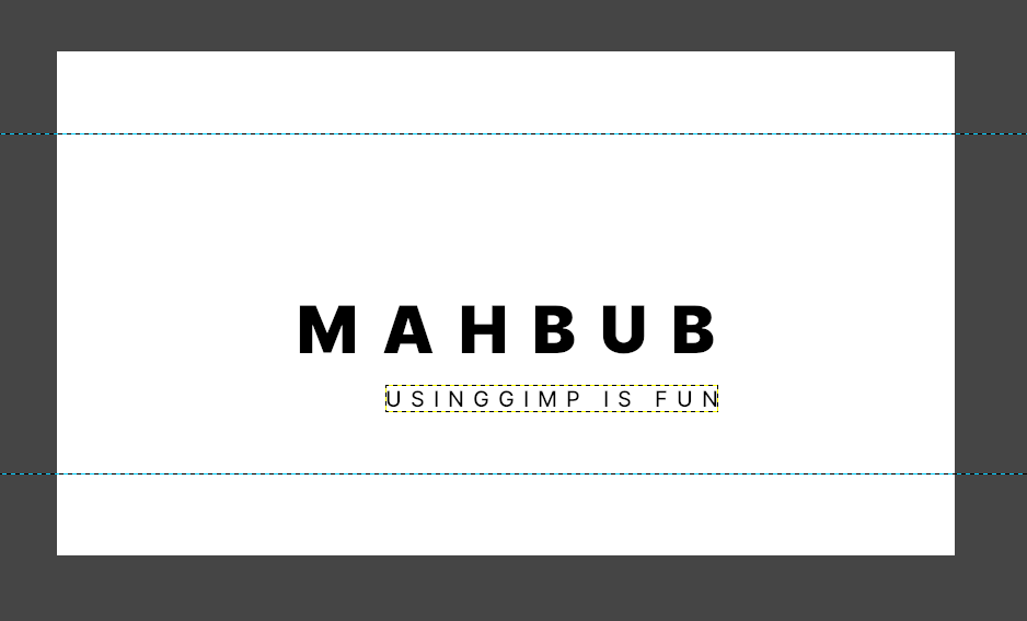
Now we need to align the tagline properly so it stays in the middle just like our main text. So select the Alignment tool (keyboard shortcut is Q), and select the main text and tagline by dragging the mouse over both of the texts.
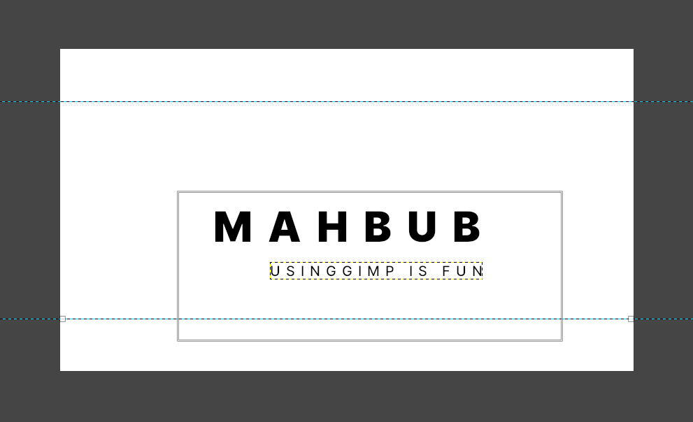
Then clicking Align center of the target, just as we did before
After aligning both, it will look like this.
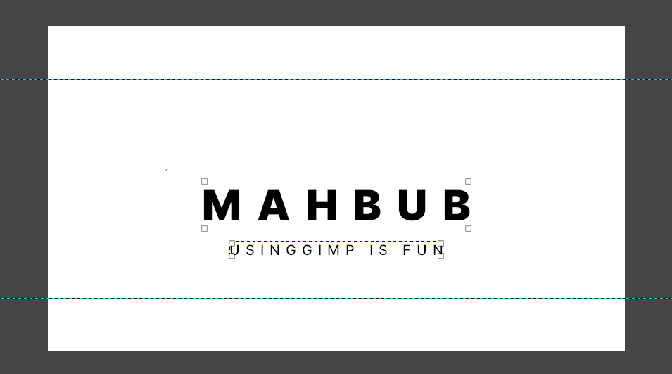
We need to move off the text a bit upward so it fits nicely. So to do this, click on the Chain icon on the layer and enable it for both text layers
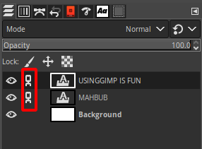
It will select both of the layers, and if you move one, it will move both. Now select the move tool and click on the object > while clicking on the text, press and hold ctrl at the same time and start dragging the text a bit upward. “CTRL” will keep the object from moving left and right so you move text up and down easily.
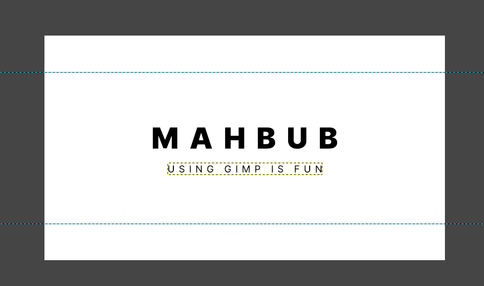
As you can see it is aligned perfectly in the middle. And is focused. So we need to create the background. BTW, I had forgotten to put a space before GIMP, and now I have given so my screenshot looks a bit different.
Creating background
For the background, we will be using a simple color gradient. It will give it a minimal look. So let’s add a background. First, create a new layer by clicking this button on the layer panel.
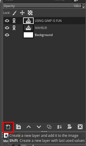
And then drag the new layer before the background.
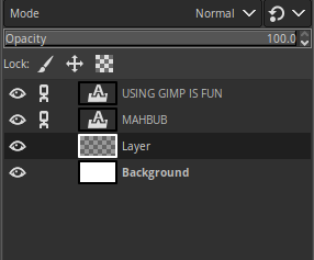
Naming layers is a good habit. It will help you to stay organized. So click on the “Layer” text and change it to “Gradient”. As we will apply a gradient to this layer. And it will be behind the texts. Now, select the Gradient tool or press “G” on the keyboard.
Note: Using keyboard shortcut will speed up your workflow
Now when the Gradient tool is selected, click and drag the mouse over the canvas. When you drag it, it may apply the default color black and white. You need to change the color by selecting a node, and then select the color option and change the color according to your choice.
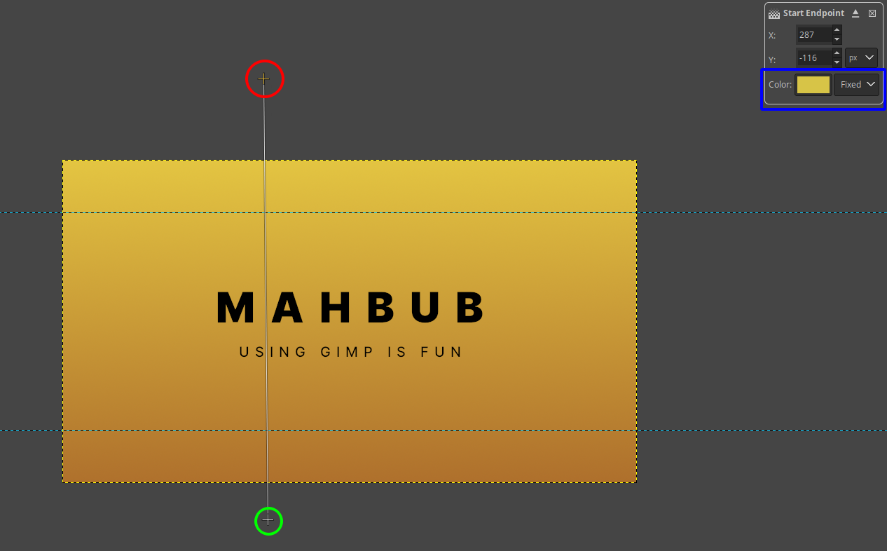
Here, red and green ones are nodes, and the blue one is where you choose a color from. When you click the color option, it will bring a dialog.
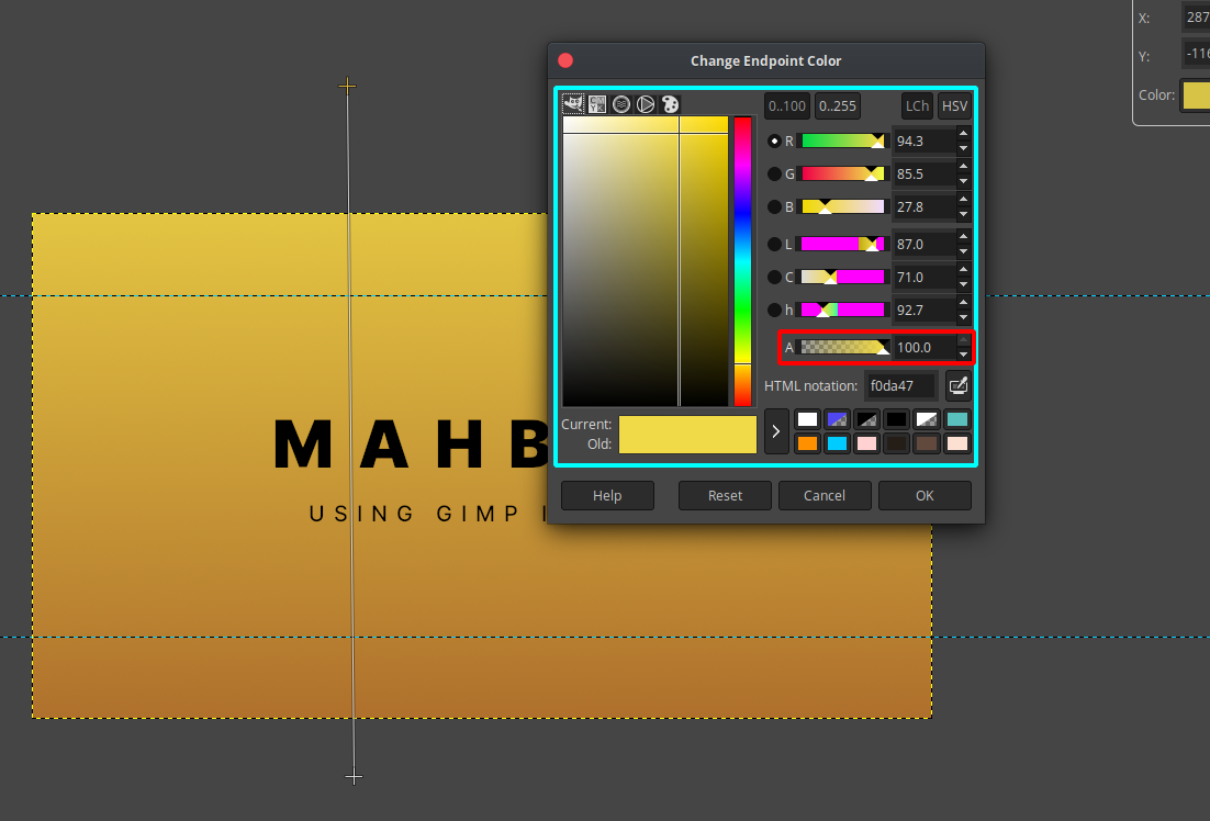
Notice the part marked with cyan is where you can select colors, combine RGB to make colors and the part marked in red is Transparency slider. Make sure the transparency is 100. I chose f0da47 for the color for the top node and chose a9672a for the bottom node.
After using the correct color of choice, and adjusting the node, it will look like this.
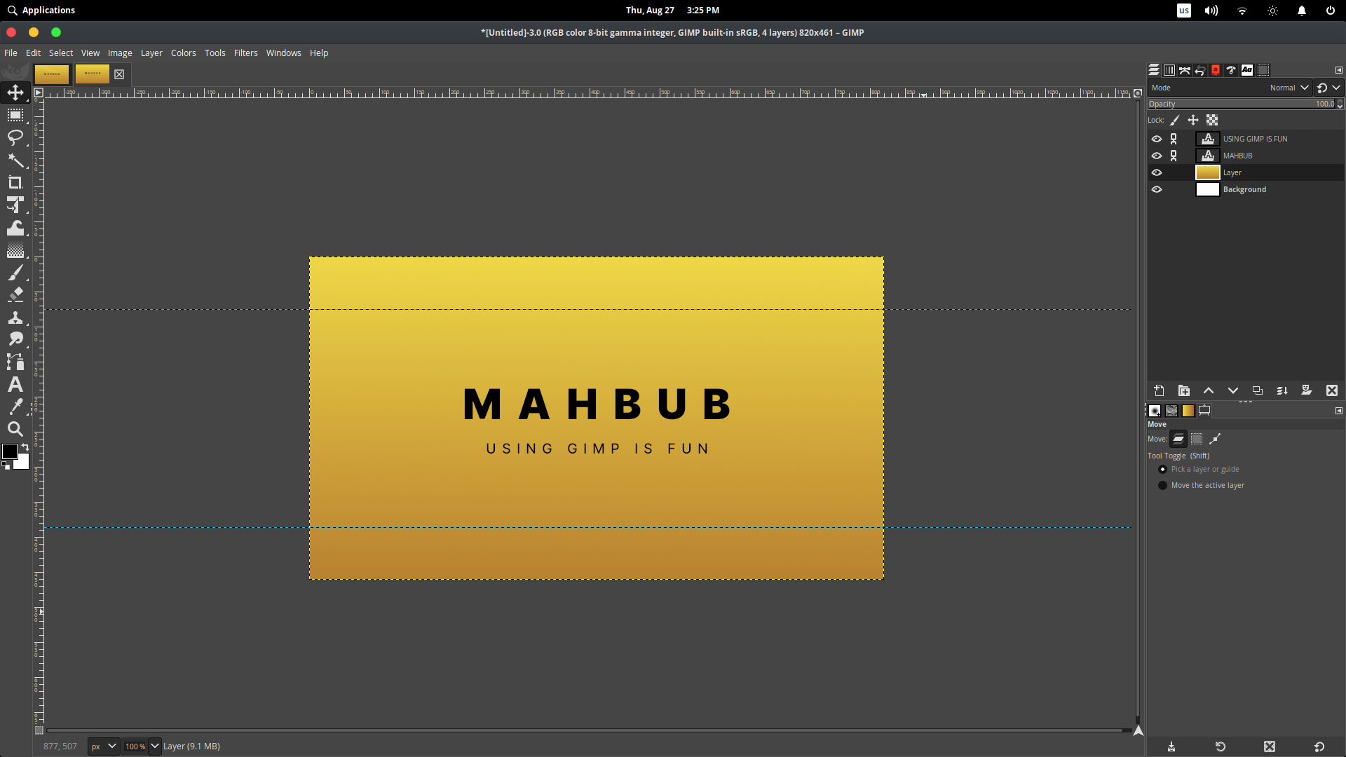
So far so good. But we want to add another layer with a vine so it looks like PS4 background or Windows 7 wallpaper like.
Drawing paths using the Path tool
To create the vine, create a new layer, name it “Vine”. Then I used the path tool (keyboard “P”). Just draw a path and hit enter to select.
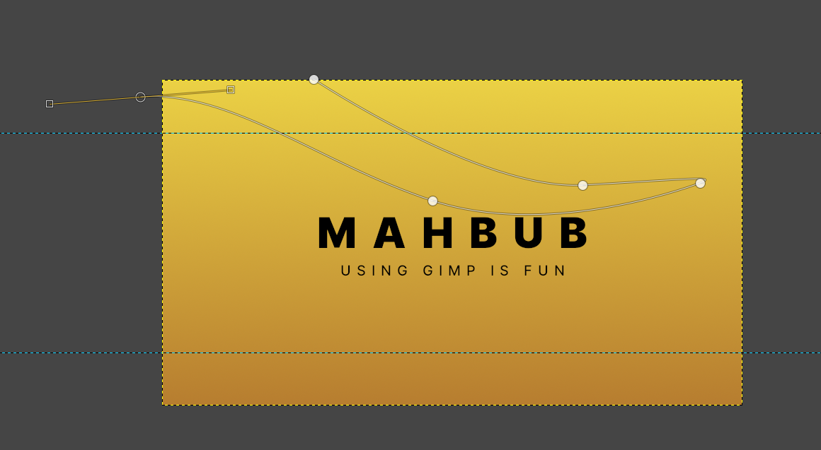
Note: Click and drag the mouse to make a curved path
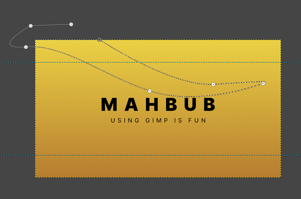
When finishing the path, hit enter on the keyboard.
And after the selection, head to Edit > Fill with BG color (make sure you have a white color selected).
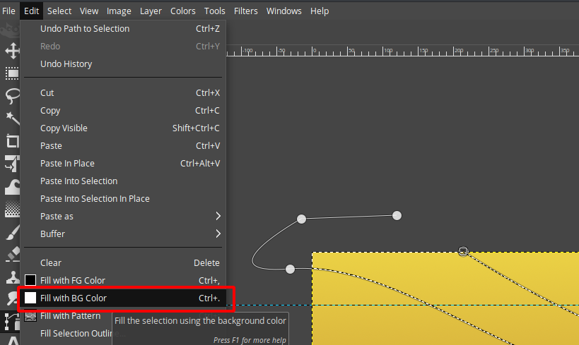
After applying color, it will look like this.
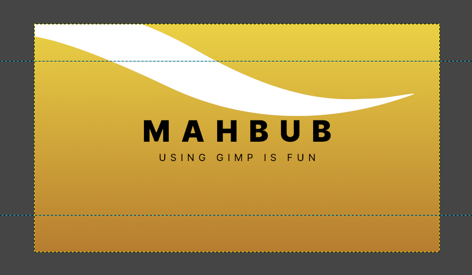
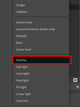
We don’t want it to be strong white. But we want it to be subtle and transparent. So to do this, change the Layer mode to Overlay.

Click the Mode and select overlay.
Change the opacity to 9.7%.

You can drag the slider or type in manually to decrease the opacity.

After reducing opacity, the result will look like this.
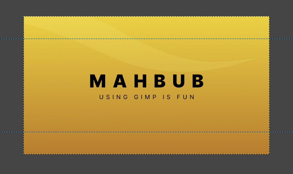
Hurray, we have finished making a simple minimal cover. Now, all we have to do is export.
Exporting your design
After successfully creating your design, you want to export it into a sharable image so facebook can use it as a cover image. Do note that saving and exporting aren’t the same thing. We want to export the design in the “.png” file type.
To export your design, go to file > export. You can also use the keyboard shortcut “Ctrl + Shift + E” to bring up the export dialog.
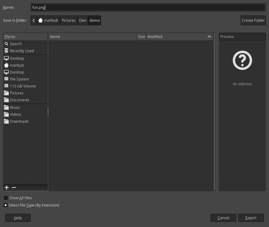
Select a location where you want to keep the exported image. For the name, type a good name and then add “.png” at the end. GIMP will automatically guess the file type by extension. After filling the name, click export. You will encounter another dialog box like this
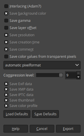
You can enable and disable any parameter, but I suggest keeping it as it is by default and then clicking export. Congratulations you made it!
Conclusion
You have successfully designed a minimal cover with GIMP 2.10. I hope if you explore more, you can design even complex designs. And while designing this simple cover, you learned all the basic stuff needed to navigate and work with GIMP. Which is an excellent achievement! Congratulations again. I hope you keep learning and keep making stuff with GIMP. Good luck.

