Well Windows. The most hated operating system in the world. Despite largest market share on the desktop part, people really hate it, even the avid users hate it. The hate is much justified when you think it has the most issues related to privacy and security. Due to the large attack surface, it is the most attacked operating system. This is also partly due to the fact that it has a core structure that isn’t much secure compared to UNIX-like operating systems.
Microsoft has a greedy hand behind Windows, as they are making more money out of OEM rather than selling subscriptions, they are using other tactics to make money. When I first installed Windows 10 on my device, I was surprised by the amount of bloatware it had compared to Windows 7 and XP. Windows 8.1 did not catch on, and I had no intent to install it. For a year-long journey with Windows 10, I had to leave it for good. But after 4 years, did they improve by any means?
The UI has changed, or?
Windows 10 came out with a distinctive design. The OS world was adopting new designs and MacOS was ahead in the race. While they tried to bring a new look and make it visually appealing, there were some issues. Navigating throughout the operating system, there was reminisce of old windows design and new flat design all mashed together in a way that it looked like a frankenstein. A mix between Windows 8 and 7.
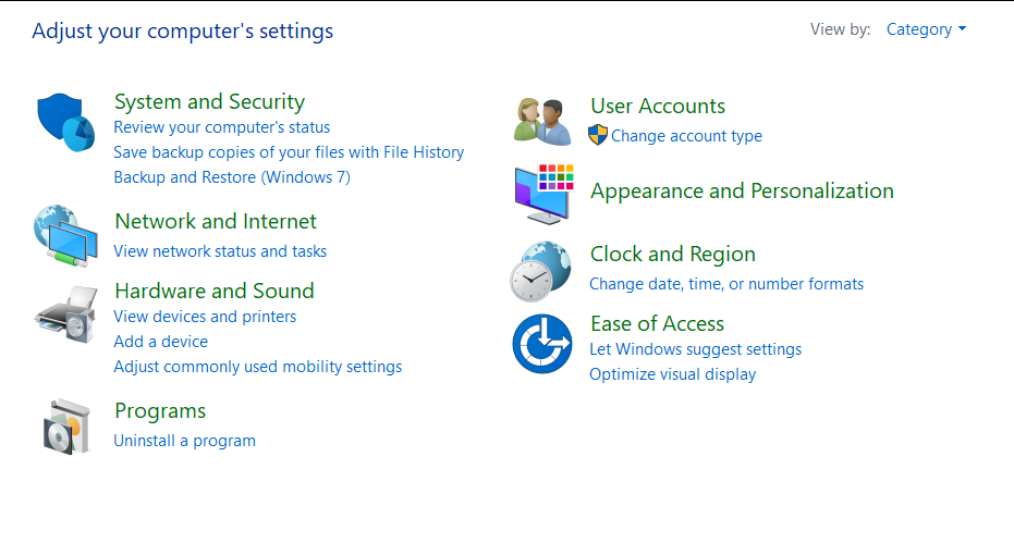
The apps came with Windows 10 has a redesigned flatter interface and the windows were looking flatter. But some of the applications still looked like Windows 7. New icons were added, but not all of the icons were newly designed. So old and new and old icons were all together. It seems they still have the problem and it isn’t improved yet. Just look at this.

You can see three types of icons all in one place. Detailed icons for system and security and old 3D icon in hardware and sound, flat minimal icon in ease of access.
The UI inconsistency remains
The user interface design hell that Microsoft created with windows 10 remains after all these years. Nothing has changed so far compared to the time I used it lastly. There are design changes here and there, including some window effect for beautifying purposes, but that just added another layer of inconsistency. With them promising UI updates again and again isn’t changing anything,
Meanwhile, multiple Linux desktops are becoming stars of the OS with polished interfaces. Elementary OS has by far the most polished desktop and Zorin OS is another distro that does Windows style desktop better than Windows 10 itself. It’s not that Windows has the most features and that’s why you cannot polish things as much as MacOS or ElementaryOS, but when you look at the Plasma desktop by KDE, you will see that it is possible to have jam-packed features and also a polished desktop experience.
Windows apps have the same visual identity and scaling across all of them, but when you look into legacy apps (even explorers), you will see that everything is very different. Things sometimes get Windows 7 style and sometimes Windows 10. Another confusing thing is, not all the MS apps follow system accents. Maybe because they want them to look distinctive, but I think that introduces more inconsistency. Moreover, some apps have theme controls and some do not.
Broken animation and effects
The transparency effect looks cool. I think this is for the users who miss the Windows 7 Aero effect. But the problem with this effect is that the animation gets broken. So when you click something, you feel like it is activating slowly while really it’s happening at normal speed. You also cannot control transparency and blur amount and other factors. Some apps have transparent blurred window title bars, and some of the apps only have transparency in the sidebar. When you make your window smaller, the effect disappears because there is no sidebar anymore. Also, these effects eat up lots of battery.
The theming aspects of Windows 10 remain clunky for another time. While they introduced some theming options, it isn’t enough. Windows is not an OS people would customize other than the homescreen or accent color, because other apps won’t follow system themes. Like if you install a GTK app, it will follow the whole GTK system theme, but in windows, I see every app having their own identity.
The constant nagging and getting in users path
Just like in the beginning, Windows constantly gets into your way with suggestions and irritating stuff. When you browse any microsoft website with other browsers, they constantly nag you to download Edge. Microsoft needs to understand that some people have their choice about what they want to use. Out of the box, Edge is the default browser, but when you try to change it, they beg you to keep using Edge. This annoyance continues across the system.
When you download an app from Microsoft Store, it constantly asks you to sign in using Microsoft annoying. Every time, even when you download a free application. There is a built in app called Feedback Hub which I named “the annoyance generator” which prompts you now and then to provide feedback on things nobody cares about. They collect tons of data already, so why do they need Feedbacks for silly things, like how is the on screen keyboard and stuff.
Note taking app, the onenote does not work without logging in (what?), Groove promotes Spotify and you don’t know if an app you see on the start menu is actually installed on your system or if it’s an ad suggestion.
Positive improvements
Windows has definitely improved some of the things. Microsoft Store was a buggy piece of crab that has received a lot of improvement this time. Along with UI improvement, it seems that it works finally. The download speed has been improved maybe because of CDN usage and the experience isn’t bad. When I first used Windows 10, the store felt like a half baked piece of garbage. But now, it works pretty well. Also, if an installation failed, it would have been stuck forever. And if you tried cancelling it, it would have resumed again and again with every startup.
The store previously lacked quality software but now it seems it has lots of applications. Although some of the apps are just wrappers for web services, like Messenger, Twitter etc. It is definitely a good thing that MS store now has important applications on it. The game catalogue has also grown and since Bethesda is now owned by Microsoft, they are focusing on bringing more games and related features to MS Store.
Settings have also improved a lot. I never thought this would replace the control panel but it is getting very close. Control panel is a horrible mess when it comes to settings management so WIndows 10 introduced a half baked alternative back then. Now it has tons of settings and controls and may soon replace the control panel totally.
Another improvement can be noticed about the bloatwares. Windows 10 no longer installs that damn Candy Crush game without permission. Although the start menu still has suggestions, it is not forced upon the users anymore. I think Microsoft tried to add another OOB game like Solitaire, but this thing is very annoying and hated. Microsoft also no longer installs most of the bloatware it used to install.
Windows has also optimized its underlying resource management too it seems. It no longer hogs absurd amounts of RAM for no reason. Maybe they finally learned to optimize. Battery life for laptops seems improved and the controls are far easier than MacOS. Just a shortcut at the battery option.
But the privacy and ToS massacre continues
Everything is fun and games until you see Microsoft basically stealing your soul. Reading terms and condition and privacy policy sends chills to the spine and makes me look like a donkey who signed up for capital punishment. They basically sign you up for an agreement that states you would defend them when legal issues arrive and you are the victim. If you are confused about what I’m talking about, read this interesting article.
And forced updates, while it is more controlled now, still is a problem. No live update and the system updates are separated from the app updates. I didn’t like the update mechanism of Windows and I don’t like it now either. The slow and constant monthly update makes the experience worse. It’s like a rolling release desktop, but with nothing new at the end.
And I don’t know where to start from about Microsoft’s worst in the world privacy practices. Microsoft assigns identifiers and tracks you even if you do not sign up for a Microsoft account. This becomes a terrible thing when you see Microsoft collecting contacts, mail data and notes data without any warning or indication. The permission management is sketchy and does not work on many applications. Software management is a hell as always and sometimes you don’t see installed apps on the list at all.
Conclusion
Windows 10 is an operating system that even avid users who are forced to use it 24/7, hate it. This is because how Microsoft shifted their focus on it as a desktop and more toward a milking cow. Yearly improvements seems don’t differ much but some of the improvements are very welcoming. The Microsoft store received a lot of improvement compared to the version I used a few years ago. Few other aspects have improved like settings. But the fundamental issues with Windows 10 remain, now even more privacy issues. The UI is a mess that will take a long time to fix and other aspects will remain the same thanks to the crooked business model of Microsoft.


