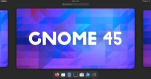
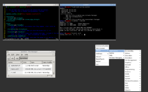
Gnome Desktop is a desktop environment I really love for a few reasons. It’s minimal, it’s focused, and it’s made to stand out of your way. Gnome is not heavy, neither bloated. The whole “Gnome is heavy” thing has gone now, and Gnome is as resource-friendly as other GTK desktops. Recently Gnome 3.38 got released and I’m very satisfied with this new release and in this article, I’m going to talk about it.
Why Gnome desktop is great
Trust me or not, Gnome is still better than some desktop environment in certain use cases. It’s minimal, simple and so polished. It is just the opposite of KDE for minimalism. KDE got all the things and features and super deep settings, Gnome got none of these.
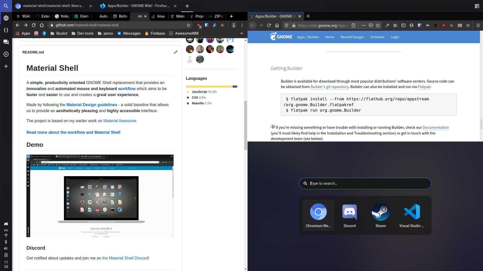
Also, Gnome is the most polished desktop. Pantheon borrowed the polish from Gnome, and I wish they kept the extension capabilities as it is so useful. Talking about extensions, Gnome got plenty of them. There are many shell extensions you can try to add from the net speed monitor to the Pomodoro timer. You can install an extension to enable desktop folders, or you can enable advanced tiling using Material Shell.
Talking about the polish, Gnome is all about it. The team behind Gnome constantly tries to make all the UI look unified and visually constant throughout the operating system. Gnome is just best at it. Gnome delivers a similar style and clarity across all its apps and parts of the desktop. The font, scaling, buttons, and color scheme stay the same all across the desktop.
Sure, Gnome looks less colorful and modern, but it only makes things simple and stable. The UI elements do not break and the color contrast is better. Gnome also makes navigating simple by implementing fewer steps and clutters while tweaking and setting things up. For instance, the Gnome settings page is much simpler than KDE’s settings page.
The new Gnome 3.38 changed itself
While making stuff simpler and usable, Gnome purposefully limited some ability and hasn’t changed a few things out of the box. Icons for the Gnome desktop look old and the color scheme feels not so modern. Until Gnome 3.38, which got released a few days ago. And thank god they improved the icons. I really love the new flat icon pack in the Gnome 3.38.
So what’s new in Gnome 3.38?
New Gnome 3.38 development was a massive collaboration of 900+ developers, which resulted in 27,000 plus commits. Most of these commits were for core Gnome improvements, but we saw some big features in this version too. Let’s see what Gnome brought for us in this version.
New icons
Gnome finally added and expanded modern icons for desktop apps. They have replaced all the Gnome app icons with their new icon set. This alone contributed to making Gnome visually attractive and much modern. I’m a big fan of these new icons.
Login with fingerprint
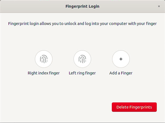
Gnome now let you log in with your fingerprint. They also provided new improved settings for adding and managing fingerprints. It will also gain you root access with fingerprints.
New Welcome app
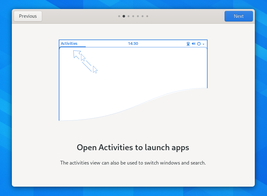
If you install a distro with fresh Gnome 3.38, you will now see a new beautiful welcome app that will help you understand basic navigation for Gnome desktop.
Rearrange menu
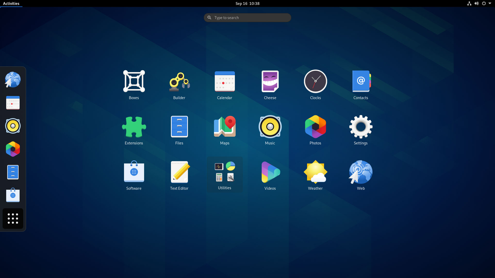
The Gnome menu now lets you re-organize the entries any way you would like. You can also add apps to the folder and name them. You can add apps to the existing folder and so on. The app grid will show fewer apps on smaller screens and also add pagination to apps in folders. A larger screen will show more apps on the grid.
Gnome Map is now convergent
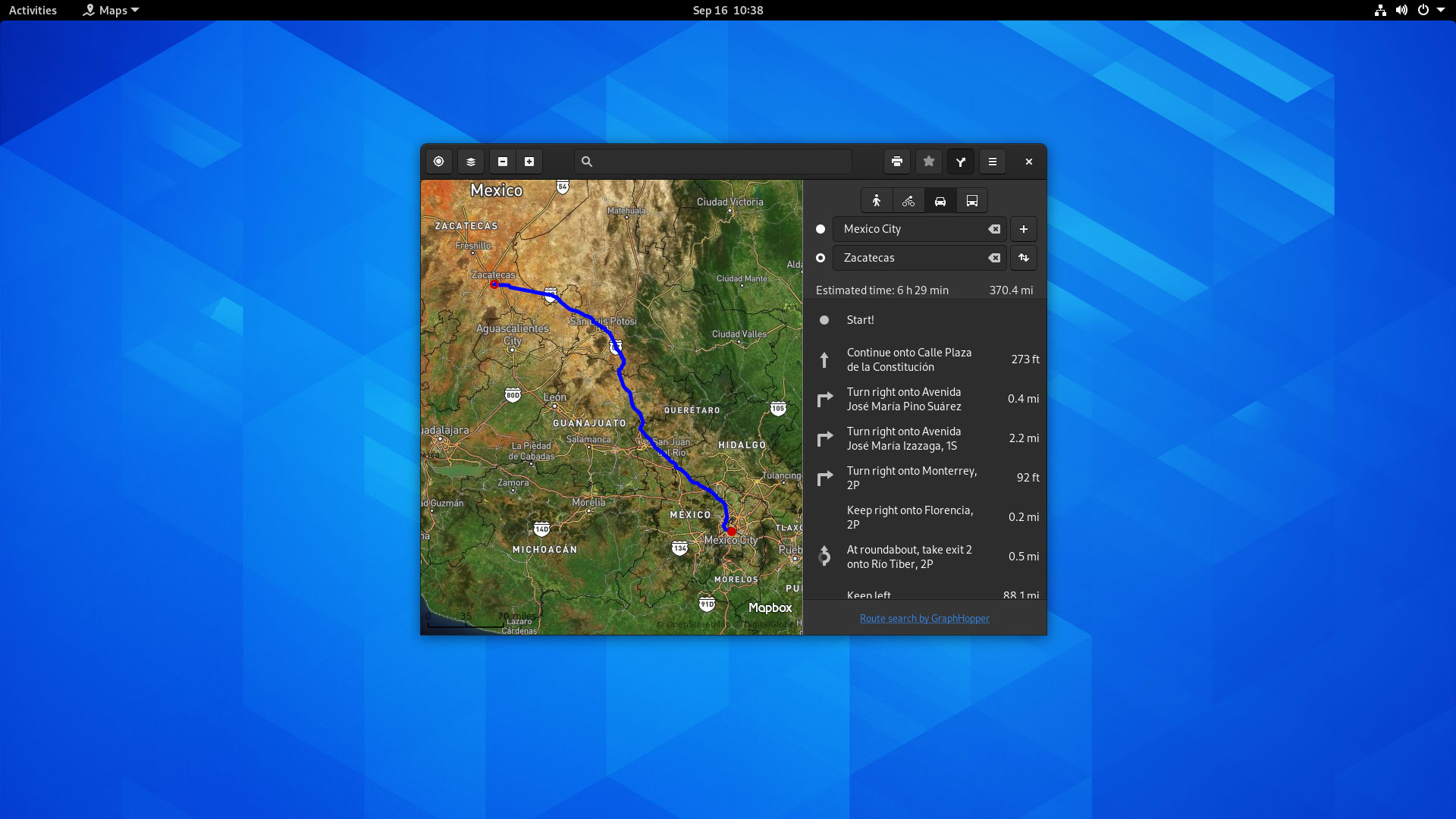
Gnome Map joins the list of mobile-ready apps for Gnome desktop. Maps now can fit nicely into smaller screen devices while retaining full functionality. It lets you run Map well on, say, Pine phone or Librem 5. There are many improvements to other convergence features too.
Overhauled UI for Gnome sound recorder
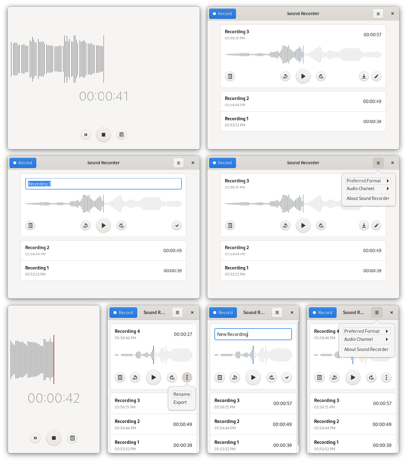
Gnome sound recording app got a fresh look. And it’s amazing. Now you can check the waveform while you are recording and playing the recorded sound. The UI got simpler and more convergent for mobile devices.
New UI for Screenshot
Although there are no additional features for the screenshot app, the gnome has made it look modern with some UI overhaul. 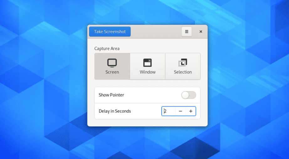
The new screenshot tool now looks way better with touch-friendly buttons and controls.
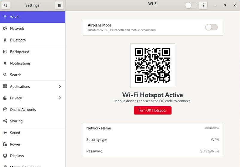
Share WiFi via QR codes
This is something new, and I really appreciate this little additional setting. Gnome now lets you share WiFi credentials via QR codes if you are running a hotspot from your device. Any Ad Hoc supported WiFi card will allow you to create a hotspot and now you can easily share connections without sharing passwords.
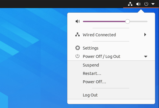
Restart from the system tray
Gnome now lets you reboot devices right from the system tray. When clicked in Power Off/Log Out drop-down, you will see a new option for Restart.
Parental Control
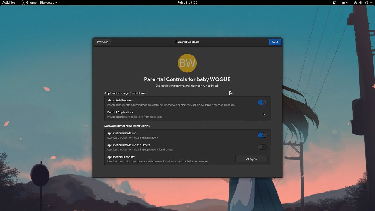
Gnome included a Parental Control feature. With this, you can now manage parental controls for your kids. You can filter web browsers and activity, restrict specific apps, disable Installation of apps, etc.
New wallpaper

Gnome 3.38 features a new colorful wallpaper. It is minimal and looks like a phenomenon. If you love minimal wallpapers, you will surely like this.
Better multi-monitor support
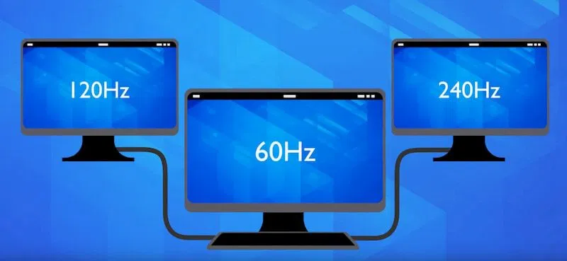
You now can run multiple monitors at different refresh rates, which were not available in previous versions. The Window Manager also received some major updates that improved overall rendering and response time for the monitors.
New notification and Calendar improvements
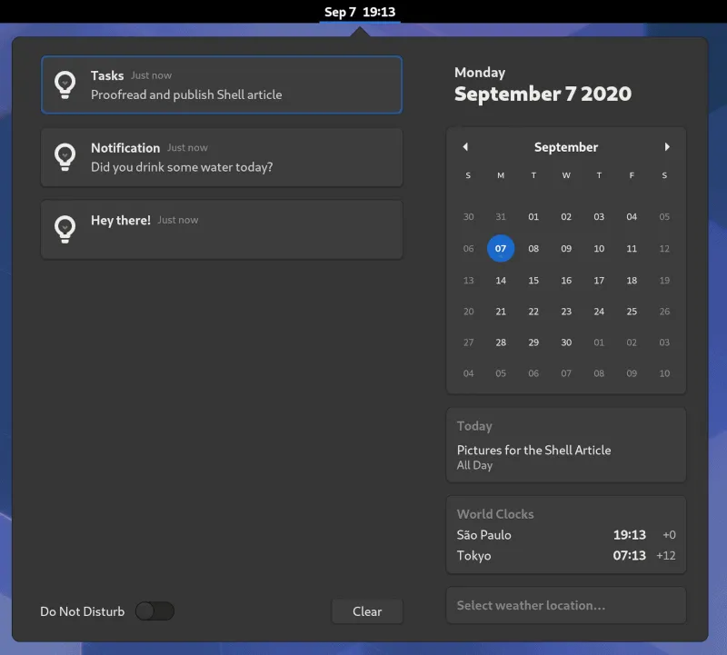
The new notification looks way cleaner and more organized. The Calendar now shows you current and upcoming events right in the widget. You can also see there are a new world clock and weather widget.
Gnome Web got improved
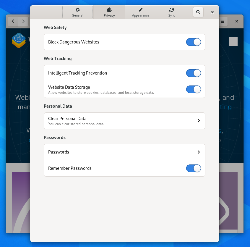
Gnome Web now lets you stop tracking cookies and fingerprinting. It now also lets you import passwords from the Chromium browser. They also improve the browsing experience in this version.
Gnome terminal got improved
The Terminal now uses an updated color scheme and improved contrast, which is more comfortable to read.
Who will get Gnome 3.38?
If you are using Arch-based or any rolling distribution, you may already have the new Gnome 3.38. If you are on the stable side, however, Gnome 3.38 will be available on Ubuntu 20.10 Groovy Gorilla. But if you want the fresh Gnome, you can have it on Fedora 33 Beta.
Conclusion
Gnome is a great Desktop environment. It is simple, minimal, and stays out of your way so you can focus on getting your work done. Many desktops follow Gnome when providing polished and consistent desktop UI and UX. Gnome is also very convergent, and Gnome apps look well on mobile. The new Gnome 3.38 adds more to these, and it is an excellent update. I like the new icon and a modern look. The wallpaper is also visually pleasing. The overall UI update for many gnome apps just made Gnome a better desktop for everyone.

