Who are we?
nixFAQ is an online publication that covers Unix and Unix-like operating systems and their related technologies, software and services.
Personality
nixFAQ holds a ……………….. (write personality)
Logo and identity
nixFAQ is a place for *nix loving, enthusiasts, developers and day to day users. Top part of our logo consists of two major icons of the *nix world. You can see the BSD daemon and also a Penguin which represents the whole *nix family and the text part includes the symbol of Shebang. Note that any part should not be used separated.
Using nixFAQ logo
In order to maintain the best use of our brand asset, we have created a detailed guideline. Here are some general guidelines for using nixFAQ assets in practice.
Please do not modify or attempt to recreate any Mozilla brand assets in any way. Do not collect our brand asset from anywhere except this page.
Colors
- On darker background, use the Light Logo
- On lighter background, use the Dark Logo


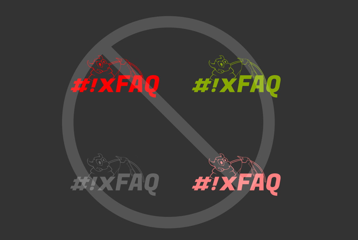
Don’t use wrong coloring
Do not use any other coloring and opacity for the logo except the one we provided. Logo should remain vivid, well contrasted and focused, and we designed it such way.
Give it room for breathing
Appropriate spacing should be used when using the logo. It makes the logo look fit and gives it breathing room.


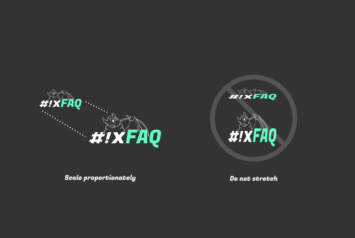
Scale it well
When scaling, scale it proportionately. Do not stretch the logo. Some software enables proportionate scaling when pressed “shift” on the keyboard. Use such feature when scaling the logo.
Minimum Size
Our logo is highly scalable and visible even when scaled small. But there is a limit you can scale it smaller. 96px is the smallest size you can scale the logo to. If you need smaller logo, there is alternative edition for it.


For icon and small scale use
For using our logo as icon or shortcut, or favicon. We have created a special edition of our logo which is suitable for such usage.